Good morning!
This post for the March plot of the month (POTM) describes a new online widget that was added yesterday to the SWMPrats web page.
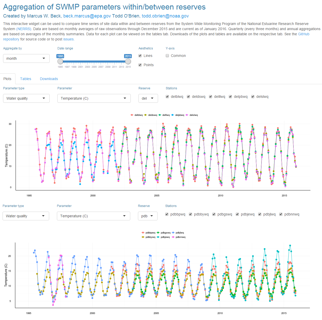
This new widget provides a simple approach to view aggregated time series of SWMP parameters across all sites in a reserve. Data can be viewed as monthly, quarterly, or annual averages. Two plots are also shown to compare aggregated time series between reserves or different parameters in the same reserve. By default, all sites for the chosen reserve and parameter are included on the same plot. Additional tabs on the app also show the data in tabular format and provide options to download pdf figures or csv files. Some of the functionality is shown below.
The control panel at the top lets you choose the aggregation period, time range on the x-axis, whether to plot points, lines, or both, and to constrain the y-axis to a common range. Selecting the checkbox for the common axis will create an additional slider to change the y-axis limits in both plots. This is useful if you want to get a better visual comparison of the same variable between reserves.
The following shows some of the features of this app.
Compare different parameters within the same reserve:
Compare the same parameter between reserves:
Choose a different aggregation period:
View the tabular data:
Download plots or csv files:
The app uses the same dataset as the SWMP
trends map widget. To reduce upload time, the dataset is based on monthly averages of the continuous time series at each site. The higher-level aggregations (quarterly, annual) are based on further averaging of the monthly data. Use caution when looking at trends at the tail ends of the time series as the dataset may have incomplete months for some years. For example, an annual summary of monthly temperature data may show an incorrect trend if only a few months (warm or cold months) are present in the first or last year. Always check the tabular and raw data to evaluate quality of the information before making conclusions about trends.
Since this is a new app I invite any feedback on improvements or if there are any questions about use. Also, please contact me if there are any problems/bugs encountered. You can reply to this thread, email
This email address is being protected from spambots. You need JavaScript enabled to view it., or post an issue
here.
Happy SWMPing!
-Marcus