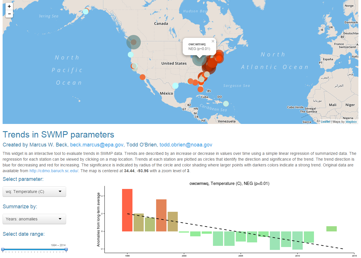
This widget is an interactive tool to evaluate trends in SWMP data within and between sites. Trends are described by an increase or decrease in values over time using a simple linear regression of summarized data. The regression for each station can be viewed by clicking on a map location. Trends at each station are plotted as circles that identify the direction and significance of the trend. The trend direction is blue for decreasing and red for increasing. The significance is indicated by radius of the circle and color shading where larger points with darker colors indicate a strong trend.